
How to Wear Colour with Confidence: A Guide to Brighter, Bolder Dressing
There’s something undeniably joyful about wearing colour. A great shade of pink can lift an otherwise simple outfit, a colourful print can completely change the way you feel in something, and an unexpected combination of colours can make pieces you’ve owned for years suddenly feel new again.
And yet, for many of us, colour can be surprisingly intimidating.
It’s easy to admire a bright blouse, patterned jacket or pair of colourful trousers on someone else and think, “That looks fabulous on her, but I could never wear it.”
The good news? Wearing colour confidently doesn’t mean suddenly abandoning your neutrals or dressing head-to-toe in every shade of the rainbow. It can start with one colourful piece, one print or even one accessory.
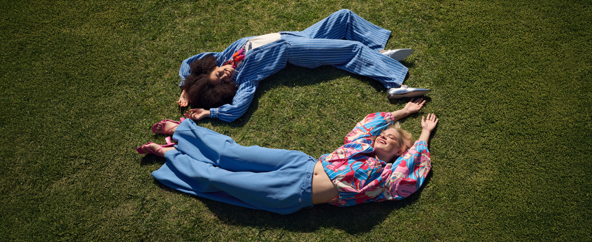
The new POM Amsterdam Spring/Summer 2026 collection is the perfect inspiration. Built around The Getaway Club, POM describes the season as capturing the relaxed, switched-off feeling of a holiday and bringing some of that energy into everyday life.
And with uplifting shades including pink, blue, green and tropical coral at the heart of the collection, it's a very good place to start if your wardrobe could use a little more colour.
Why Are We So Afraid of Colour?
Neutrals feel safe.
Black works with black. Navy works with white. Denim works with almost everything. There’s very little risk involved, which is exactly why so many wardrobes gradually become dominated by the same dependable shades.
Colour introduces another decision.
Does this go with that? Is it too bright? Can I wear pink with orange? Does this colour suit me? Am I going to walk into lunch feeling like everyone is looking at me?
But wearing colour doesn’t have to be complicated.
The secret is to stop thinking of colourful dressing as an all-or-nothing decision. There are countless degrees between wearing beige from head to toe and leaving the house dressed like a packet of Fruit Tingles.
You get to decide where you sit.
How to Start Wearing More Colour
If your wardrobe is currently built around navy, black, white and denim, don't feel as though you need to reinvent it.
In fact, those pieces are exactly what will make introducing colour easier.
Start With One Statement Colour
One of the simplest ways to introduce more colour into your wardrobe is to choose a silhouette you already feel comfortable wearing and simply change the colour.
A bright pink top with your favourite jeans, for example, doesn’t require any new styling skills. The outfit itself is familiar. The colour is the only thing that has changed.
The bright rose pieces in the new POM Amsterdam collection are a perfect example. Pink brings the personality, while everything else can remain beautifully understated.
Try a bright knit with blue denim and simple shoes. Or wear a colourful blouse with your favourite navy or white trousers.
You don't have to build the outfit around five different colours.
One is enough.
Treat Denim as a Neutral
When we talk about balancing bright colours with neutrals, we usually think of white, beige, navy or black.
But don't forget denim.
Blue denim behaves almost exactly like a neutral, which makes it one of the easiest ways to introduce brighter shades into your wardrobe.
Pink with denim. Coral with denim. Green with denim. A colourful print with denim. They all work.
POM's Spring/Summer 2026 collection makes particularly good use of pale and mid-blue denim alongside stronger shades and prints. The result feels fresh and colourful without becoming overwhelming.
If you've fallen in love with a bright POM blouse but aren't quite ready for the matching trousers, start with your favourite jeans.
Suddenly that intimidating print becomes much easier to imagine wearing.
Let a Print Choose Your Colours for You
Printed clothing can look complicated because several colours are competing for your attention at once.
But a good print actually makes styling easier.
Think of the print as your colour map.
Take POM Amsterdam's colourful Urban Flora print. Blue, pink, coral and white already sit together within the design. Instead of wondering what could possibly work with it, simply choose one of those colours and repeat it elsewhere in the outfit.
A printed blouse containing blue? Try blue jeans.
Pink within the print? Try pink trousers.
White detailing? White trousers instantly simplify the look.
You don't have to find an exact colour match either. A lighter or darker version of one of the shades can often make an outfit feel more interesting.
The print has already done the difficult part for you.
How to Wear More Than One Colour
Once you feel comfortable introducing one strong colour, things start getting interesting.
This is where POM Amsterdam really comes into its own.
The brand has never been afraid of an unexpected combination, and Spring/Summer 2026 is no exception. Within the collection, shades of blue sit alongside bright orange, coral and cayenne, with vivid green and pink also playing prominent roles.
The trick isn't necessarily finding colours that "match".
It's finding colours that look good together.
Try Tonal Dressing
One of the easiest ways to wear a lot of colour is surprisingly simple: wear variations of the same colour.
Pink with pink. Blue with blue. Green with green.
This is known as tonal dressing, and because everything belongs to the same colour family, the overall outfit can actually feel calmer than an outfit containing several contrasting colours.
The shades don't need to match perfectly. In fact, it's often better when they don't.
Try a soft pink top with deeper pink trousers, or a bright blue blouse with blue striped pants. Differences in shade and texture give the outfit dimension while the shared colour connects everything.
POM demonstrates this idea beautifully throughout SS26, including looks that build several related shades into a single outfit.
Try an Unexpected Colour Combination
Pink and orange.
Blue and coral.
Pink and blue.
These combinations might sound bold when written down, but seeing them together tells a different story.
If you're unsure, start by letting one colour dominate while the second plays a supporting role. A blue outfit with a touch of pink is much less daunting than splitting the outfit evenly between the two.
Then, as your confidence grows, turn up the volume.
A striped pink and orange tee worn with jeans is an easy starting point. Wear that same tee with pink trousers and the look becomes stronger. Pair it with POM's shiny pink pants and you've officially graduated from colour school.
Repeat a Colour to Pull Everything Together
Have you ever looked at someone wearing several colours and patterns and wondered why their outfit somehow works?
Often, there's repetition hiding within it.
Perhaps the blue in a printed jacket is repeated in the trousers. Maybe the pink within a blouse reappears in a shoe, scarf or bag.
Repeating a colour gives the eye somewhere familiar to return to and helps make an outfit look deliberate rather than accidental.
POM does this beautifully with its bolder prints. Even when several colours, stripes or textures appear together, repeating one of the shades elsewhere connects the pieces.
It's a particularly useful trick when you want to experiment with more adventurous styling.
How to Mix Prints and Colour Without Looking Overdone
Colour and print often arrive together, and this is where even confident dressers can hesitate.
The same principles still apply.
Look for something the pieces have in common.
Two different prints can work beautifully together if they share a colour. A striped top and floral jacket might sound like a lot on paper, but if blue appears prominently in both, that repeated colour creates cohesion.
You can also vary the scale. A bold floral print paired with a simpler stripe often feels easier on the eye than two equally busy designs competing for attention.
And remember: you can always add a quiet piece between them.
Denim, white, navy and other wardrobe staples give bold prints breathing room.
POM's SS26 styling frequently combines sporty stripes and expressive prints with familiar pieces such as denim, tees, blazers and knitwear, making the season a particularly good example of balancing statement dressing with everyday wear.
What Colours Should I Wear?
You've probably encountered plenty of rules about which colours you should and shouldn't wear.
Some styling systems can certainly provide useful guidance, but they don't need to become another set of fashion rules.
Instead, pay attention to how you feel when you wear different colours.
Which jumper always gets compliments?
Which blouse makes your skin look brighter?
Which colour do you repeatedly pick up when you're shopping?
And, perhaps most importantly, which colours make you happy when you put them on?
You may discover that you naturally gravitate towards cooler blues and pinks. Perhaps you love warm coral and orange. Or maybe green is the colour that somehow makes everything else in your wardrobe work.
Once you've identified a few favourites, you have the beginnings of your own personal colour palette.
And that makes future shopping easier too.
"But I'm Too Old to Wear Bright Colours…"
Who decided colour has an expiry date?
There isn't an age at which pink suddenly becomes inappropriate. Nor does orange belong exclusively to twenty-somethings.
Style changes as we do, but becoming older doesn't mean gradually removing personality from your wardrobe.
In fact, colour can be one of the easiest ways to make the silhouettes you already love feel fresh again.
You don't have to wear metallic pink trousers.
You don't even have to wear a print.
A beautifully cut knit in cobalt blue instead of navy might be enough. A colourful scarf can completely change a neutral outfit. A pink blouse under a familiar jacket adds colour without demanding all the attention.
You're still wearing the clothes that feel like you.
You're simply giving yourself a few more options.
And if you happen to adore bright colours, fabulous. Wear them.
Colour Confidence Doesn't Happen Overnight
The word confidence is important here.
Because the more you experiment with colour, the less unusual it begins to feel.
Perhaps today it's a bright pink top with jeans.
Next time, it's the colourful printed blouse.
Then you realise the pink trousers would actually look rather fabulous with it.
Before long, you might find yourself contemplating the matching Urban Flora blouse and trousers and wondering why you ever spent so many years playing it safe.
There is no right destination.
Colour confidence isn't about becoming the loudest person in the room. It's about knowing what you like and feeling comfortable enough to wear it.
Start small. Experiment. Look at what you already own. Try combinations you wouldn't normally consider.
Sometimes the outfit you assume won't work is the one you end up loving most.
Discover POM Amsterdam Spring/Summer 2026
If there was ever a collection designed to encourage a little experimentation, POM Amsterdam Spring/Summer 2026 might be it.
Titled The Getaway Club, the collection is inspired by the restorative feeling of getting away from everyday routine and bringing some of that freedom back home. POM describes the season as a collection designed to "celebrate life", filled with uplifting colour, expressive prints and playful combinations.
From vivid pink and sky blue to coral, stripes, florals and statement denim, the new season offers plenty of ways to introduce colour at whatever level feels right for you.
Start with one piece.
Then see where it takes you.